With ProVision 5.1.3, we are making some significant updates to the dashboard and data visualization. With some big improvements on the UI side, we are finally showing the basics of our new dashboard framework. We started simple to get the basic improvements live, but have also managed to have a foundation where users can build their own dashboards (more information coming after the release). The good news is this is just HTML and JavaScript, so there are no random dependencies; just run the standard upgrade and you should see the new dashboard as expected.
As a quick example, here are a few dashboard gadgets that we are QAing and testing out (you can also tell we are providing different layout options).
So here we go – Part 1!
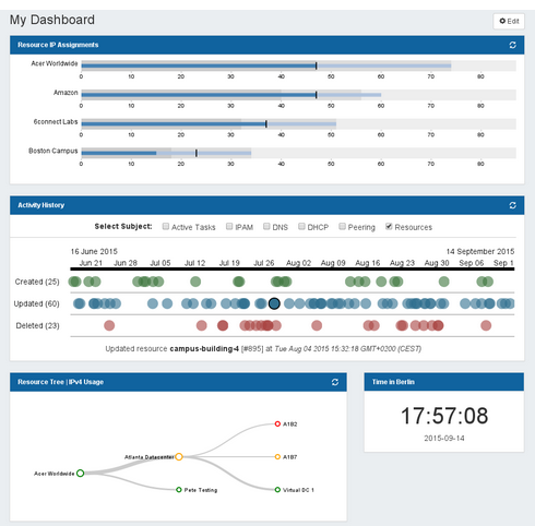
Resource IP Assignments are shown “per Resource” but you can see activity over the last day, week, and month. We will be adding more elements to make the data easier to read, but if there are stats that are helpful, send ideas over to feedback@6connect.com.
The Activity History is a long awaited view that we have been experimenting with. Typically log data is hidden, so we wanted to better expose the information for the user so there is a real “snapshot” of what’s happening inside of ProVision across the different functional areas. The fun part is that the user can zoom in/out to get more detail. Of course, the user can click on a circle and get the action/resource/zone that was modified and then jump to it. And of course the “activity list” is different depending on the area, so IPAM has IP activities, but DNS has DNS activities. That allows the user to get detail for the area they care about.
For the Resource Tree – IPv4 Usage, we are making some updates on the UI side but also wanted to show utilization data more clearly. By experimenting with color, we are working on some tweaks to make this more usable and a “saved” dashboard gadget. So an admin could save views that they care about and go from there. In the example here, we are using the node colors as an indicator of IP utilization and will be working in some more elements with the line thickness to provide more data.
The Time in Berlin gadget was a simple experiment, but initial feedback has shown it useful. Since we have users where “local time” may not be where the server resides, this provides an easy way to check items for scheduling tasks.
So on to Part 2!
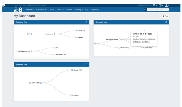
On this Dashboard, you can see a “50/50” layout and a few examples of Resource Views. In these views, you can tweak each view as you wish – even if they reference each other. If you click on a given resource, you will also get more relevant information on the Resource and have an option to jump out to it. We plan on displaying some other Resource data like IPs assigned, zones assigned, etc. Stay tuned!
Questions? Concerns? You can contact us at 6connect to speak directly with an engineer. If you are looking for a turnkey solution for robust DNS management and automated network resource allocation, we’ve got your back.
Email: info@6connect.com or call +1 (650) 646-2206.